Philips 30PW8420 30" CRT direct view HDTV
This shows graphs of RGB levels, color temperature, luminance, gamma and CIE diagrams of my Philips 30PW8420 30" CRT direct view HDTV
before and after I performed a calibration using an Eye One Display LT colorimeter and HCFR analysis software. This was a very quick
calibration that took about 30 minutes using limited TV controls. I will add some screen shots shortly.
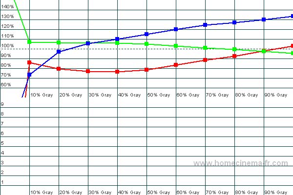
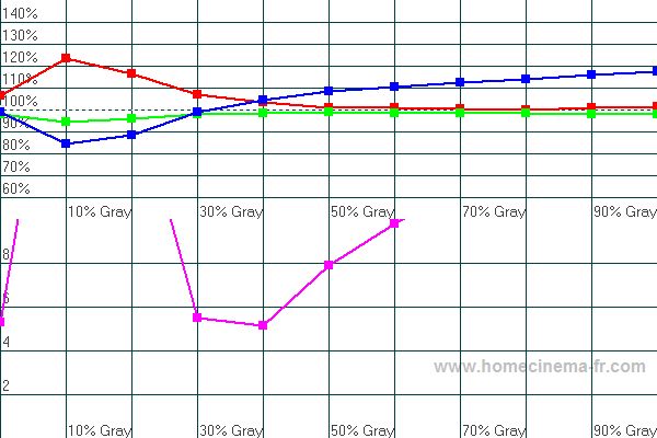
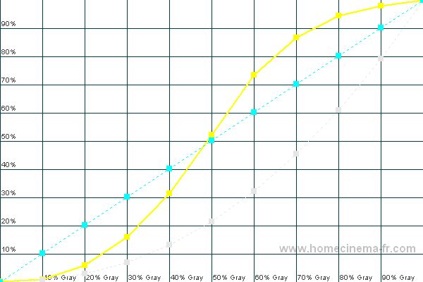
RGB Levels
Ideally the red, blue and green levels should all be at 100% all the way from black (0%) to white (100%). This allows the TV to produce neutral grays of any intensity.
The purple curve shows the percentage away from ideal at each level of gray. This line would be at 0 for a perfect RGB level.
Before: It's easy to see how the red, blue and green curves don't align, which creates unnatural shades of gray.
After: The red, green and blue are aligned much closer, however there is still a bit of tweaking that can be performed.
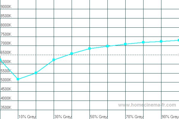
Color Temperature
The proper "color temperature" is 6500K all the way from black (0%) to white (0%).
Before: Because the RGB levels were so far above above, the color temperate is completely off as well.
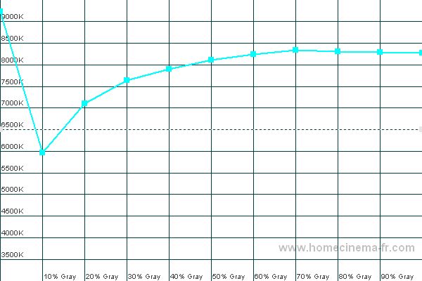
After: The color temperature is much closer to the desired level.
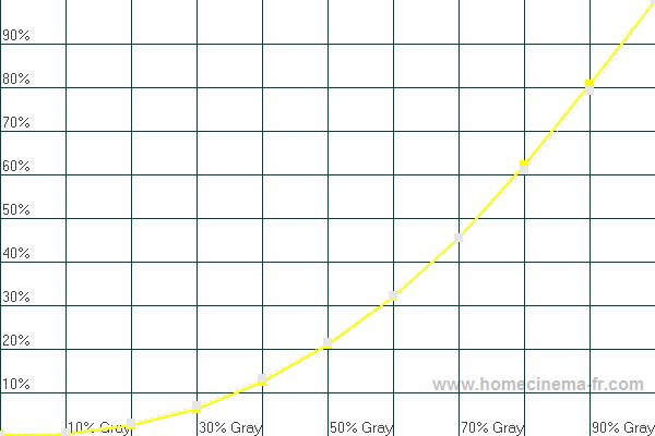
Luminance
Luminance is a measure of light output at different shades of gray. The yellow curve is the TVs actual luminance, while the light gray dotted curve is the reference luminance we wish to achieve.
Before: Light output was way too high at all levels of gray.
After: Now light output is nearly perfect.
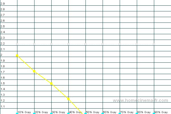
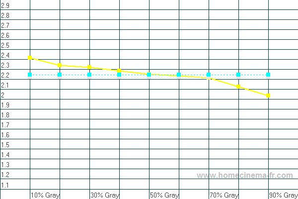
Gamma
Gamma is a measure of light output at different gray levels. Gamma is mainly a choice about shadow detail vs. darkness of blacks. A gamma higher than 2.2 will give a higher contrast
ratio and deeper blacks, but it also reveals less detail in dark scenes.
Before: The gamma was so bad it's not even on the graph.
After:
Now the gamma curve is very close to ideal, which allows for much better shadow and white details.
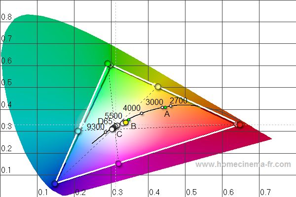
CIE Diagram
The CIE diagram shows information about the primary colors (at the corners), secondary colors (in between the corners), color temperature and grayscale. The diamonds with the crosses in
the middle are the standard definitions of each color that we strive to achieve. The solid circles are the measured colors of the TV. It is usually not possible to adjust the TV to
achieve correct definitions of the colors, so we try to find the best balance overall. The white circles in the middle are the different shades of gray. Ideally they should all line up
at the D65 mark.
Before: You can see that red and blue were fairly close to the HD standard, however green was pretty far off, and all 3 secondary colors were off a lot as well.
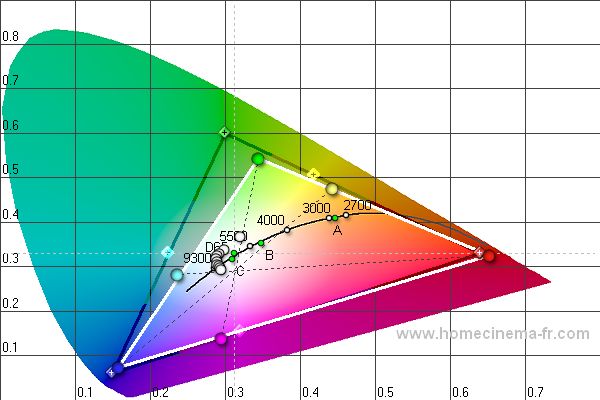
After: Now all 3 primary colors and all 3 secondary colors are very close to the HD standard.